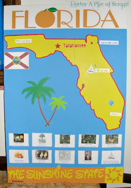
This past week, my daughter Brooke, had to do a presentation on one of the states in the USA. She chose "The Sunshine State" of Florida.
I guess if you're gonna have to a project like this to do in March, it might as well be some place sunny & warm!
At first, I was going to use my Cricut to cut out the state of Florida using the "50 States" Cricut cartridge. It's a great cartridge for this kind of thing & the very reason I got it in the first place. But Brooke wanted a really large state cut out. To be honest with ya, I was not all that comfortable trying to cut the state into two pieces with my Cricut. So, I relied on my Silhouette Cameo to do it for me using their Designer Studio. It made very quick work with no guess work needed on my part.
The poster is really pretty simple in design, but it's how my daughter wanted to do it, which probably makes it easy for her and the rest of the 3rd grade class to absorb.
We put everything on a piece of white foam board that we purchased at Dollar Tree for $1. The colored poster board we used for the blue and the yellow is less than a dollar! (I think it was 69 cents - white is 50 cents) And this poster board cuts on the Cameo like a dream!
I thought it was cute that she wanted the sun at the bottom corner to look like the "Cutie Mark" on Celestia from the My Little Pony cartoons.
The font that was used for the Florida title is called "Upper East Side". If you click on the font name, it will take you to Dafont.com, where you can download it for free!
The font that was used for "The Sunshine State" is called "Walt". I'm not sure where I got that exact font, but Dafont.com has one almost identical called "Waltograph."
Brooke said that everyone was fascinated with her poster and swarmed all around to get a better look at it. And here I thought it was very plain & simple.
I guess that just goes to show that the best projects are the ones that are "Simple with a 'Wow!' factor."
Now that this is all done, I'm going to cover the backside of the foam board with fabric and use it as a back drop for taking pictures of my projects.

Parties I'm linking to:


3 comments:
Her project came out cute! She picked a warm state.
Well, it sure looks great, Beth... and Brooke! Yess, thinking warm thoughts...
Don't I wish I was there right now.
We got a bit of snow here today.
Her project turned out great. I have learned to let my girls tell me what they need help with, or I will take over their whole project, lol.
Post a Comment