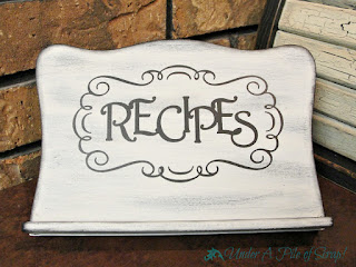
I don't recall where I found this sweet looking stand, but you can bet it was either a garage sale or thrift store. I just had to get it because I loved the shape of it!
I used my Cricut Expression to cut out the stencil from just cheap ol' contact paper that I get at Walmart. The frame design is from the Splish Splash cartridge and the font is from the Nursery Rhymes cartridge, and I used the Cricut Design Studio software to arrange the letters inside the framework.
It started out as just your basic honey colored wood that I went over with a base coat of black paint first and then went over that in white with a little distress sanding. I left the edge black because I think that really sets it off, although it's hard to tell in this photo (you can see it a little on the top left corner)
I like to try to make things that are functional look pretty, as well. I don't know about all of you, but I know I'm more likely to use something if it's sitting out and easily accessible, like saaaaay....sitting on the counter or a shelf. If it's going to sit out in plain site like that, why shouldn't it look pretty?! Exactly.
Now I'm almost talking myself into keeping it, but I have to remind myself that it's for my craft show & that's in just a few weeks! Ack!!
Wish me luck in getting puh-lenty of stuff done and doing great in sales.

Parties I'm linking to:


4 comments:
I think this very neat.
Cynthia
This is awesome.
I really like the fancy scroll design.
I use that contact paper on my glass ornaments.
Very cute! Maybe you should keep it. ~ Maureen
Pretty and functional!
Thank you for linking up at the Wildly Original party!
<3 Christina at I Gotta Create!
Post a Comment