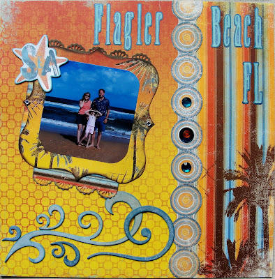
I hope my little idea works out OK without any problems on the close up of the page below, but that remains to be seen. Ya see, I took the cool clam shell packaging that the buttons & bling comes in with the domed cover & used it like a shaker box for some of my daughter's favorite sea shells & some of the "sand", which is actually crushed sea shells & they must be stained like they've been in rusty water. That is what creates the orange look to the beach. I'm not sure what makes it rusty or what crushes the shells, but it was interesting to see!
Another cool looking trick I tried (which I only did because I already had quite the dimension going on with that shaker box! *snort!*) but I even layered my bling jewels. I used the Orange ones that come in this collection and I used the deep turquoise ones that come in the Flutter Butter collection. The center stones are the great big ones that I placed a smaller stone of the opposite color on. They don't look great in pictures, since the top stones seems to shade over the bottom stone, but they create quite an impact in the light!
**I updated this photo from the original post because I needed a better color quality photo of the beach, but since everything is stuck in place, I just cut the new photo a bit smaller & did a 3 dimensional layer over the old one. The old photo is like a frame for the new one!

Under the family photo on the right hand page, I created a hidden journal tag that you can pull from the bottom that tells of our brief time spent at this beach. It was definitely interesting to see, but most likely not a place that we'd go back to hang out a lot. When we left there, we had what felt like a greasy film that was rusty colored (maybe the salt in the air?). You definitely would require a shower after walking on this beach. I will say that it was very private with NO solicitors for time shares, like you get when you're at Daytona! I recommend this place to visit at least once just for the cool experience. We even had a really nice local who offered to take our picture for us, but it was such a windy day that I had to hold my hair down & maybe it's really breezy along the ocean, I don't know, since I'm from northern Indiana. LOL!! That's what I used those cool looking chipboard swirls for, they reminded me of the wind & the waves.

The only thing on this project that isn't Bo Bunny is the small border punched strip above the family photo. I thought it sort of mimicked sea shells & it's from EK, but I don't remember what it's called.
That's what I have today.
God bless & have a greatly creative day!


5 comments:
Love this -- it's so bright and happy and summery and fun!
Great job putting the shells and sand on there!! Love that idea!
Gorgeous layout! I love the shaker box :)
Ohhh freakin' COOL! LOVE how you layered the new photo on top of the older one! Such a neat framed look :) GREAT idea, Bethie :D
This is simply wonderful. I love the colors. The shaker box is the best.
Post a Comment